12 Essentials Before You Launch Your Startup Website
A practical startup website design checklist covering messaging, page structure, mobile usability, SEO, performance, credibility, analytics, and launch testing.
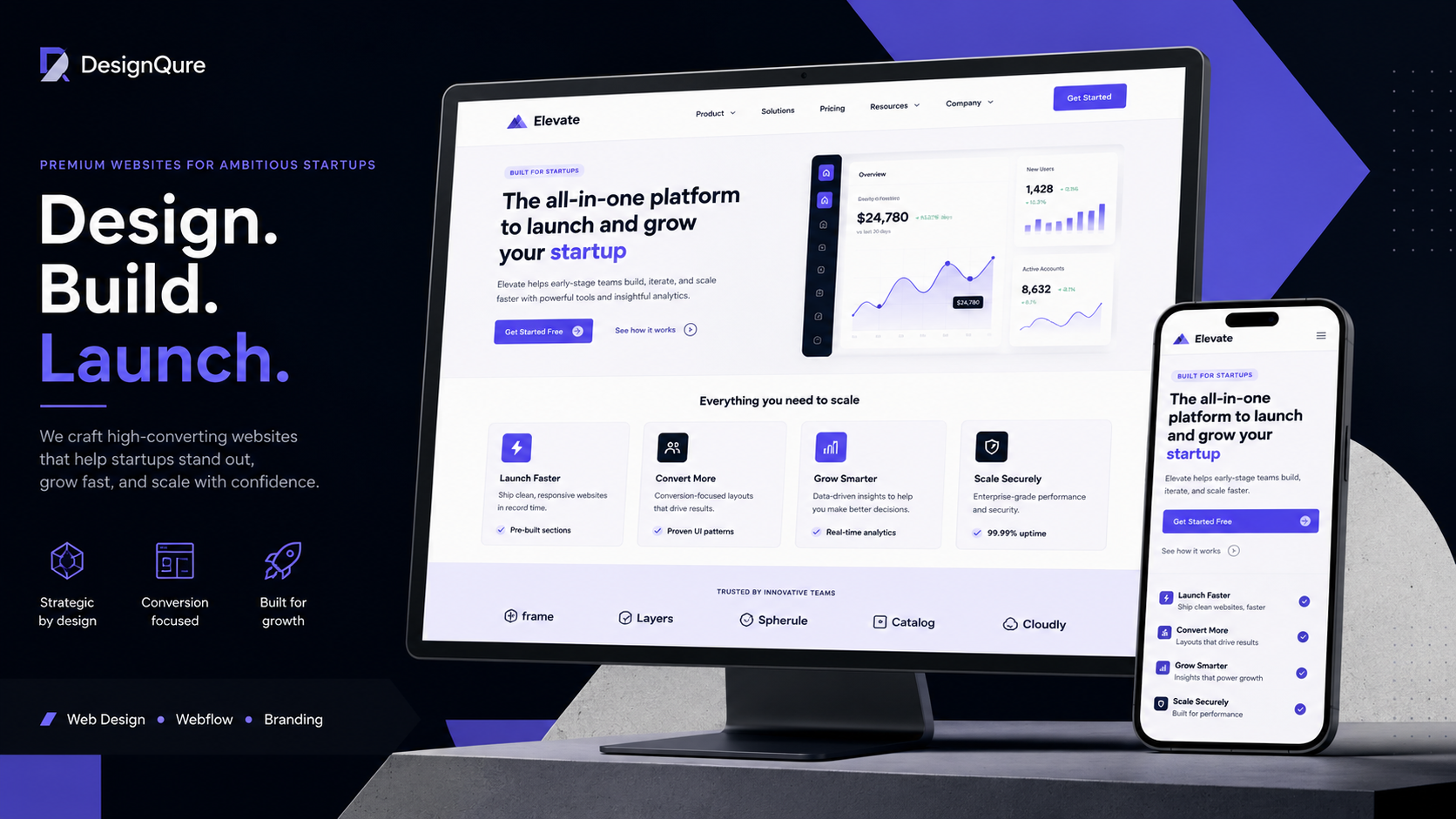
A startup website has a difficult job.
It must explain an unfamiliar idea, earn trust in a business that may still be new, answer important questions and persuade the visitor to take the next step. It often needs to do all of this before the startup has an established reputation, a large content library or years of customer reviews.
That is why effective startup website design is not simply about choosing attractive colours and placing a product mockup in the hero section.
Your website needs to communicate four things clearly:
- What your startup offers
- Who it is built for
- Why someone should trust it
- What the visitor should do next
This startup website design checklist covers the essential decisions to make before launching, from messaging and page structure to SEO, performance and accessibility.
1. Decide What the Website Must Achieve
Every startup website should have one primary business objective.
That objective could be:
- Booking product demonstrations
- Generating qualified enquiries
- Collecting waitlist registrations
- Starting free trials
- Selling a product
- Attracting investors or partners
- Encouraging app downloads
A website can support several actions, but one should remain clearly more important than the others.
When every button has equal visual weight, visitors are forced to decide what matters. When the primary action is obvious, the website guides them towards the next logical step.
Before designing the homepage, complete this sentence:
The main purpose of this website is to help visitors ________.
The answer should influence the page hierarchy, calls to action, navigation and content.
A startup collecting early-access registrations will need a different website from one selling an established software subscription. The first may need a focused landing page. The second may require product pages, pricing information, integrations, case studies and support content.
2. Write a Clear Value Proposition
Your hero section should explain the startup before it tries to impress the visitor.
A useful startup value proposition usually identifies:
- The product or service
- The intended customer
- The problem being solved
- The main outcome or benefit
- The reason the solution is different
Avoid opening with broad claims such as:
- Building the future
- Innovation without limits
- Transforming possibilities
- Your partner in growth
- Solutions for tomorrow
These statements sound ambitious but reveal very little about the business.
A stronger headline communicates a specific outcome.
For example:
Vague:
Smarter technology for modern teams.
Clearer:
Automated inventory forecasting for independent retail teams.
The supporting copy can then explain how the product works or why it is different.
A visitor should not need to scroll through several sections to understand the basic offer. Clever language can create personality, but clarity must come first.
3. Organise the Website Around Visitor Questions
Founders often structure websites around internal company terminology. Visitors, however, arrive with questions.
A useful website structure answers those questions in a logical order:
- What is this?
- Is it relevant to me?
- What problem does it solve?
- How does it work?
- Why should I trust it?
- What does it cost?
- What should I do next?
This sequence can guide the structure of the homepage.
A typical startup homepage might include:
- Hero section with the core offer
- Problem or customer pain point
- Product or service explanation
- Key benefits
- How it works
- Product interface or service visuals
- Customer proof
- Pricing or engagement model
- Frequently asked questions
- Final call to action
Not every startup needs this exact order. The point is to build the page around the visitor’s decision-making process, not a collection of disconnected sections.
4. Create the Right Pages
Some startups try to fit the entire business into one long homepage. Others launch with dozens of mostly empty pages.
Neither approach is automatically better.
The website should contain enough pages to explain the offer without spreading useful information too thinly.
Most startup websites should consider the following:
Homepage
An overview of the startup, its offer, its strongest proof and the main next step.
Product or Service Pages
Dedicated pages explaining each major product, service or use case. Separate pages also make it easier to target more specific search terms.
About Page
The startup’s story, purpose, team and relevant experience. This page matters particularly when the business is unfamiliar or operates in a trust-sensitive industry.
Pricing Page
Useful when pricing can be presented clearly. Businesses with highly customised services may use a qualification form or consultation process instead.
Contact or Demo Page
A focused conversion page with a short form, clear expectations and alternative contact details where appropriate.
Resources or Blog
Educational content that answers questions customers search for before choosing a provider or product.
Legal Pages
Privacy, terms, cookie information and other notices required for the startup’s location, audience and data practices.
A startup can launch with fewer pages and expand later. What matters is that every published page has a clear purpose.
5. Show the Product or Service
Abstract descriptions make new ideas harder to understand.
Whenever possible, show visitors what they will receive.
For a software startup, this might include:
- Real product screenshots
- Interface demonstrations
- Short walkthrough videos
- Interactive product previews
- Before-and-after workflows
- Integration examples
For a service startup, it could include:
- Deliverables
- Process diagrams
- Project examples
- Sample reports
- Timelines
- Clear service boundaries
Avoid filling the website with interface mockups that do not represent the actual product. A polished but inaccurate visual may attract attention, but it can also create the wrong expectations.
Visuals should make the offer easier to understand, not simply make the page look busier.
6. Add Credibility Before Making Big Claims
A new startup may not have hundreds of reviews or recognisable customers. It can still provide credible evidence.
Trust signals can include:
- Named customer testimonials
- Case studies
- Pilot programme results
- Founder experience
- Relevant certifications
- Security practices
- Product documentation
- Transparent pricing
- Clear contact information
- Partner or integration logos
- Press coverage
- Real team photographs
- Detailed explanations of the process
The evidence should match the claim.
A logo strip does not explain what result was delivered. A testimonial saying “great team” provides less useful evidence than one describing a specific problem and outcome.
When customer proof is limited, be transparent. Clearly explain what has already been built, tested or validated instead of trying to make the company appear older than it is.
7. Use Calls to Action Consistently
A call to action should tell visitors what will happen after they click.
Generic buttons such as “Learn More” or “Get Started” are sometimes appropriate, but more specific wording is usually easier to understand.
Examples include:
- Book a Product Demo
- Join the Early-Access List
- Start Your Free Trial
- View Pricing
- Request a Website Proposal
- Explore the Platform
- Talk to a Specialist
The main call to action should appear in several relevant locations, including the navigation, hero section and final section.
Secondary actions can support visitors who are not ready to convert. These might include viewing a case study, watching a demo, reading documentation or comparing plans.
The goal is not to place a button after every paragraph. It is to provide a logical next step when the visitor is ready.
8. Design for Mobile From the Beginning
Mobile design should not be treated as a compressed desktop layout.
Google uses the mobile version of a website’s content for indexing and ranking. Google also recommends responsive web design because it uses the same URL and HTML while adapting the presentation to different screen sizes. g a startup website on mobile, check:
- Whether the headline remains easy to understand
- Whether buttons are comfortable to tap
- Whether text is readable without zooming
- Whether menus are simple to operate
- Whether forms work with mobile keyboards
- Whether animations affect scrolling
- Whether important content has been removed
- Whether comparison tables remain usable
- Whether images are cropped correctly
- Whether fixed elements block the page
Mobile layouts may rearrange or collapse content, but important information should not disappear merely because the screen is smaller.
9. Make Performance Part of the Design
Large animations, oversized images, external scripts and complex effects can make a startup website feel impressive during a presentation but frustrating during normal use.
Performance should be tested on realistic mobile devices and connections, not only on a developer’s computer.
Google’s Core Web Vitals assess loading performance, responsiveness and visual stability. The current “good” thresholds are:
- Largest Contentful Paint at or below 2.5 seconds
- Interaction to Next Paint at or below 200 milliseconds
- Cumulative Layout Shift at or below 0.1
These measurements are assessed at the 75th percentile of page visits. mance improvements include:
- Compressing and resizing images
- Serving modern image formats
- Avoiding unnecessary video backgrounds
- Reducing third-party scripts
- Loading non-essential resources later
- Reserving space for images and embeds
- Limiting heavy animation libraries
- Preloading genuinely critical assets
- Using efficient font files
- Testing pages with PageSpeed Insights
Animation is not automatically bad. It becomes a problem when it delays content, causes layout shifts or makes the interface harder to control.
10. Build the SEO Foundation Before Launch
SEO should influence the website structure before development is complete.
Google describes SEO as helping search engines understand content while helping users decide whether they should visit a page. It also makes clear that following best practices does not guarantee a first-place ranking. rtant page, prepare:
- A unique page title
- A useful meta description
- One clear primary heading
- Descriptive subheadings
- A short and readable URL
- Relevant internal links
- Descriptive image alt text
- A canonical URL
- Open Graph information
- Indexable page content
Choose a distinct search purpose for each page.
For example:
- The homepage may target the main brand proposition.
- A service page may target “website design for startups.”
- A blog article may target “startup website design checklist.”
- A comparison page may target a platform-specific query.
- A case study may target an industry and service combination.
This reduces the chance of several pages competing for the same search intent.
Do not create pages by repeatedly inserting the same keyword. Google states that it does not use the meta keywords tag and that excessive keyword repetition violates its spam policies. te genuinely useful pages that answer specific customer questions. Google says its ranking systems are designed to prioritise helpful, reliable content created for people rather than content produced mainly to manipulate rankings. he Website Accessible
Accessibility improves the website for people using different devices, input methods and assistive technologies.
A basic accessibility review should include:
- Descriptive alt text for meaningful images
- Sufficient colour contrast
- Clearly labelled form fields
- Visible keyboard focus states
- Logical heading structure
- Keyboard-operable navigation
- Error messages that explain what went wrong
- Captions or transcripts for important video content
- Reduced-motion support where appropriate
- Buttons and links with understandable labels
The Web Content Accessibility Guidelines require text alternatives for non-text content when that content communicates information or serves a functional purpose. xplains that descriptive alt text helps search engines understand an image and its relationship to the surrounding content. t text as a place to force keywords. Describe the image and its purpose naturally.
12. Install Measurement Before Launch
A website cannot be improved intelligently if nobody knows how visitors use it.
Before launch, decide which actions should be measured.
These may include:
- Form submissions
- Demo bookings
- Trial registrations
- Pricing-page visits
- Product video plays
- Case-study views
- Downloads
- Account creations
- Checkout starts
- Purchases
Analytics should connect website activity to the startup’s actual objectives.
A high number of page views means little if the main goal is qualified demo bookings and nobody completes the form.
After launch, review:
- Which pages attract search traffic
- Which pages lead to conversions
- Where visitors leave
- Which devices experience problems
- Which search queries create impressions
- Whether forms generate useful enquiries
- Whether calls to action are being used
- Whether new content strengthens existing service pages
Treat the first version as the beginning of the process, not the final version.
Startup Website Launch Checklist
Before publishing, confirm that:
- The offer is understandable without internal company knowledge.
- The primary audience is clearly identified.
- The main call to action is easy to find.
- Navigation labels are descriptive.
- All links and buttons work.
- Forms send submissions to the correct destination.
- Confirmation messages explain what happens next.
- Desktop, tablet and mobile layouts have been tested.
- Images are compressed and correctly sized.
- Page titles and meta descriptions are unique.
- Important pages are indexable.
- A sitemap has been generated.
- Canonical URLs are correct.
- Social-sharing images are configured.
- Meaningful images have alt text.
- Legal and privacy pages are available.
- Analytics and conversion events are working.
- Spelling, grammar and factual claims have been reviewed.
- No placeholder text or unfinished sections remain.
- Error and 404 pages provide a useful next step.
Common Startup Website Design Mistakes
Trying to Explain Everything at Once
A homepage should introduce the business and guide the visitor. It does not need to contain every product detail, company milestone and future ambition.
Move detailed information to dedicated pages.
Writing for Investors Instead of Customers
Investor language often focuses on market disruption, proprietary technology and long-term vision. Customers usually want to know whether the product solves their immediate problem.
The website can speak to both groups, but the main message should match its primary audience.
Copying a Popular Startup Template
Templates can accelerate production, but unchanged templates create interchangeable brands.
Customise the content hierarchy, typography, visual system, interaction patterns and proof around the actual business.
Using Animation Without a Purpose
Movement should explain, guide or provide feedback. Animation that exists only to demonstrate technical ability can distract from the offer and reduce performance.
Hiding Important Information
Making visitors request a call for basic information can create unnecessary friction.
Provide enough detail for people to decide whether the startup is relevant before asking them to submit personal information.
Launching Without Real Content
Designing around placeholder text often creates layouts that fail when the actual copy is added.
Use realistic headlines, descriptions, screenshots and calls to action during the design process.
Should a Startup Use a Template or a Custom Website?
A template can be suitable when:
- The startup needs to validate an idea quickly.
- The offer is relatively straightforward.
- The available budget is limited.
- The website has simple functionality.
- The team can work within an existing structure.
A custom website becomes more valuable when:
- The product is difficult to explain.
- The brand needs to look distinctly different.
- Several audiences or use cases must be addressed.
- The website requires custom interactions.
- Search visibility is central to growth.
- The site must connect with other business systems.
- The current template is limiting conversion or expansion.
The choice is not really between “cheap” and “premium.” It is between using an existing structure and creating one around the specific business.
A carefully adapted template can outperform a poorly planned custom website. A strategically designed custom website can outperform a template when the startup has outgrown generic constraints.
Frequently Asked Questions
What should a startup website include?
At minimum, a startup website should explain the offer, identify the intended customer, present the main benefits, provide credibility, answer common questions and include a clear next step. Depending on the business, it may also need product pages, pricing, case studies, documentation, a blog and legal pages.
Can a startup launch with a one-page website?
Yes. A focused one-page website can work for an early-stage startup with one offer and one conversion goal. More pages should be added when the business needs to explain separate services, target additional search queries or support a longer buying process.
When should SEO begin for a startup website?
SEO planning should begin before the website structure and content are finalised. Page topics, URLs, headings, internal links and technical requirements are easier to organise before launch than to repair afterwards.
How often should a startup website be updated?
Update the website whenever the offer, product, pricing, proof or customer questions change. Search performance and conversion data should also be reviewed regularly so weak pages can be improved and new content opportunities can be identified.
What makes a startup website look credible?
Clear messaging, real product visuals, transparent information, named testimonials, relevant founder experience, professional execution, visible contact details and well-supported claims all contribute to credibility.
Build a Startup Website That Explains the Idea Clearly
The best startup websites are not the ones with the most effects, pages or buzzwords.
They make a new idea feel understandable. They show why it matters. They provide enough evidence to reduce uncertainty and make the next step obvious.
DesignQure creates websites for startups that need to launch with clearer positioning, stronger visual credibility and a structure built around real customer decisions.
Explore DesignQure’s startup website design service or request a free website diagnosis to identify what your current website needs before its next stage of growth.